How effective is the combination of your main product and ancillary texts.
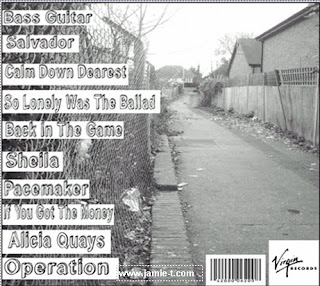
We had to create a band image to promote the artist through the album text. The digipack presents the image of Jamie T and the indie genre. The front cover, back cover and the two inside selves show the main theme and ideas that the video it's self also displays. This is the idea that the character himself is from the suburbs, and that music is his passion ( inside selves, close up guitar images). The inside sleeves show a close up of two guitars, showing the 'inside of music', representing a iconic instrument that he uses and showing visual motifs. These images connote that music is his salvation, and that it is a part of him.
The front covers leading line is his name, which is in large font, which catches the audiences eye. This connotes juxtaposition within the text, and pulls the audiences eyes down to the name of the album and the images of guitars that line the bottom of the image. These images connote his star persona. This was constructed using Dyer's critical framework. It shows the consumption of the audience and the paradoxes within the text. The idea that he is ordinary, however he is still extraordinary. This is seen in his untidiness, the use of black and white, and the realism within the video.
This is compared with the lighting, close ups and the authentic performance which makes him become different from the ordinary person. The front cover represents his music, the place he grew up, and the social background he is from (middle class/ suburban life). He is showing that even though he has hit stardom, he still sticks to his roots and doesn't forget where he came from. This theme is also present in his music, and is also seen in similar bands/artist from the same genre.
I took inspiration from certain photomontage artists for the front cover of the album, Such artist as Hannah Hoch . This artist uses photomonatage to create art that is sometimes political and very expressive. I liked this idea off taking different views on something and putting them together to create , in this case, a view of Jamie T and his music. (examples of Hannah Hoch's work)
The use of visual motifs is reinforced by the artist and what he means to his audience, and the character that we see. It shows what his music represents and how we, as an audience, are supposed to consume his work. The text design anchors the image, especially on the back cover (below) as it has a layout and colour pallet that matches, and fits in with the genre. Also the font that is used on the back cover is made to look hand written and represent the style of his music. The main image which is used in the background for the front and back cover represents the 'journey' that he as a musician will go on as he becomes a well know artist.
We designed this magazine advertisment to run in NME magazine. We chose to design a half page advertisement (below) which we got inspiration from a previously seen advertisement by the Dandy Warhols. The image we used in the advertisement is a still shot from our video. This shows a recognisable face/image for the audience to be able to familiarise with. The colours also run in with the video itself,and the audiences eye is drawn to his face, then left across to the text which gives you the details of what the advertisement is about.
All the ancillary texts and the video all separately have their own representation of the video, artist and music. They are however all linked together in similar ways, through the medium of colour schemes, images, and certain references. The texts link through the genre and idea that Jamie T from the suburbs and his character is laid back, but he is still a successful artist. They all link to the video through the colours that are shown and the costumes that are used throughout.


No comments:
Post a Comment