Wednesday, 16 December 2009

HG - Evaluation of music video

What have you learned from your audience feedback .


We used a focus group for our audience research, targeting young teenagers/young adults and asked between 12 and 20 people for each time we carried out our reasearch. It was important that we tested our concept in pre-production to an audience because it gives us valuable answers and can also give us new ideas that can be worked into the our already established idea. We used survey monkey (site example below) to construct our questionnaire. This is a simple site to use and has the available components to create a questionnaire that can be sent to numerous people.


examples of questions I asked:


  • ' Would you expect a indie musician to be wearing ? a) suit and tie b) tracksuit bottoms and tee-shirt c) skinny jeans and shirt'


  • ' Would you expect alcohol to be seen/present in a indie music video?'


  • 'Would you expect to see any outdoor scenes?'

The results we got back from our first audience feedback showed that we to change and adapt our ideas we had already to meet the demands of an indie music video, and give the audience what they would expect and want to see. One of the questions we asked was, ' would you expect to see an outdoor performance scene in a indie music video', the majority of the answers we received back were 'yes' unsurprisingly. This gave us the idea to do a busking scene. Our research feedback was mainly positive and gave us the incentive to try different ideas to fit in with the genre of our video.


We also tested a rough cut of the video on our class, and the main result we got back were that we needed to have more narrative scenes within our video. From this feedback we decided to add more narrative shots into our story board, giving more meaning to the actual video.


Finally we used Survey Monkey again to produce another audience questionnaire to get feedback on our final video. This final test of our finished piece to the audience showed that we needed to give ourselves more time, as the majority of results expressed that there could have been more variety on some parts of the video, and looking at this we feel didn't reach our full potential. We however noted that we managed to identify the genre well, and the audience were able to detect that.

(below, a sample of our final questionnaire)

JJ - Evaluation of Music Video

How did you use media technologies in the construction and research, planning and evaluation stages?


We used blogger.com as a collaborative e-portfolio in our group throughout the planning, construction and evaluation we scanned our planning sheets and call sheets in to our blogs to show our planning process. When we took a trip to Brighton to get a feel for locations we could use. We tried out different techniques on DV cameras, including different shot types. We also took pictures for a location reccie for our piece on a digital camera to upload to our Blog. This also allowed me to try out new editing techniques in preparation for our final piece.


In our planning process we evaluated other videos in this genre. We embedded videos from YouTube of the track, then used pictures to show specific shots used. We also used multi media in our planning process such as the use of Slideboom which allowed us to upload our PowerPoint pitch. We also used embedding to display our animatic of our ideas for our video.


When shooting we used DV cameras, we used different shot techniques when shooting, we used a dolly in the performance shots, this created a smooth panning shot with a low angle shot. We used a high angle shot when the main character was in a bad state playing guitar on the steps. These to angles show the ups and downs of his life. We used the cameras to films 1 second shots of the table filling up with alcohol and bottles, to then create a stop motion effect. When we shooting in the house we used a handy cam to follow the main character but creating a relationship with the audience.


When editing we used a variety of techniques to create the final piece such as a fast cutting rate in the house, as well as a stop motion effect which we the cut with a shot when the main character comes out from the bathroom. We used many dissolves to create smooth transitions from different shots and scenes. We altered the Hue and Contrast on some of the performance shots so the lead singer is the main object in the screen. We were required to slow and speed up some shots to match lip syncing.


In the print media, we used magnet lasoo tool to cut out the guitars fro the front cover of the digipack. We removed the colour for the shots of the alley way and guitars to create a moody effect. We used the magic wand tool when we were cutting out single images from solid colours. To fill the background of our advertisement we used the clone stamp tool to match the colours and then used that colour to fill the rest of it.


Sunday, 13 December 2009

JJ - Evaluation of Music Video

In what ways does your media product use, develop or challenge forms and conventions of real media products?


Jamie T is a indy/rock artist, many videos from this genre have many performance based shots, of the lead singer and the musicians playing. Therefore when planning our video we decided that it was neccesary for our video to include our main character singing and playing the guitar. However if we look at popular indy rock videos we can also see a narrative, usually a love story of some sort. So we included refrences to a love story but only small shots to create a narrative fuzz.
We have used close up shots of our main character singing and playing guitar.
In his previous videos he references to alcohol, girls and drugs. Therefore our videos conforms to these conventions, when planning and story boarding our idea we thought that we needed to show Jamie T going down hill using alcohol as a catalyst. This allows the audience to relate to the star, this was also done through the fact that he appears a lot in the video. This also references the genre of the song.


This is a relation to the music and visuals aswell as lip syncing the words with the stars mouth movements. Our stopmotion matches the beat of the song.We matched the guitar playing with the guitar on the song because our main character was able to play the song. The song describes his fall and rise in the music industry and his career as a musician, so we screend the depressive and lonely bits in black and white and the shots that he is sucessful again in full colour. The dissolves use show the narrative as smooth transitions howeever in the drinking scenes they are left out this adds impact to the song.


We therefore included strong conventional mise-en-scene from this genre such as a indy dress style we used Jamie T's previous videos to create his appearance. When creating props we made they were appropiate for each shot, we created a messy look and feel to the video which conformed to the indy scene. There are references to british teen television shows such as Skins in the drinking scenes.


This shot shows the intertexuality of the popular British TV series Skins.


Our main artist performs in a first person mode of address in the performance shots when singing at the camera, this breaks fourth wall. This allows a strong relationship between the audience and the performer. We also use the notion of looking with the use of mirrors in the house shots.


The heavy drinking is typical of male singers, and also stereotypical of how most rock stars deal with the stress of being famous and stardom. This also links to most of the shots the lead singer being alone showing him as a lonesome person, dealing with the downfall of his music alone. This creates a image and back story of the main character that the audience of the genre will be able to relate to. The house also represents his social classs and status, showing that he is a suburbian but not someone from the lower classes. The guitar is iconic of Jamie T, therefore we have used closeups of him playing the gutiar, as well as the guitars shown in the print media.
The use of binary oppositions is apparent throughout the video, we have showed Jamies rise and fall, from his rough days going and busking trying to live on whatever he can make that way to a admired singer and successful performer.


These shots are examples of binorary oppsitions in our video.


In the print media we included semiotics, such as the front cover ofs picture of an alley way, this conotates that the artist is a suburban musician and this is typical of the genre and the artist. The guitars on the front cover are in full colour this signifies that this is a rock artist, he plays the guitar as well as showing this iconic guitar symbol, however this conotates that the guitar brings colour to Jamies life.


Thursday, 10 December 2009

HG - Evaluation of music video

How effective is the combination of your main product and ancillary texts.


We had to create a band image to promote the artist through the album text. The digipack presents the image of Jamie T and the indie genre. The front cover, back cover and the two inside selves show the main theme and ideas that the video it's self also displays. This is the idea that the character himself is from the suburbs, and that music is his passion ( inside selves, close up guitar images). The inside sleeves show a close up of two guitars, showing the 'inside of music', representing a iconic instrument that he uses and showing visual motifs. These images connote that music is his salvation, and that it is a part of him.


The front covers leading line is his name, which is in large font, which catches the audiences eye. This connotes juxtaposition within the text, and pulls the audiences eyes down to the name of the album and the images of guitars that line the bottom of the image. These images connote his star persona. This was constructed using Dyer's critical framework. It shows the consumption of the audience and the paradoxes within the text. The idea that he is ordinary, however he is still extraordinary. This is seen in his untidiness, the use of black and white, and the realism within the video.

This is compared with the lighting, close ups and the authentic performance which makes him become different from the ordinary person. The front cover represents his music, the place he grew up, and the social background he is from (middle class/ suburban life). He is showing that even though he has hit stardom, he still sticks to his roots and doesn't forget where he came from. This theme is also present in his music, and is also seen in similar bands/artist from the same genre.


I took inspiration from certain photomontage artists for the front cover of the album, Such artist as Hannah Hoch . This artist uses photomonatage to create art that is sometimes political and very expressive. I liked this idea off taking different views on something and putting them together to create , in this case, a view of Jamie T and his music. (examples of Hannah Hoch's work)


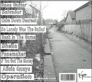
The use of visual motifs is reinforced by the artist and what he means to his audience, and the character that we see. It shows what his music represents and how we, as an audience, are supposed to consume his work. The text design anchors the image, especially on the back cover (below) as it has a layout and colour pallet that matches, and fits in with the genre. Also the font that is used on the back cover is made to look hand written and represent the style of his music. The main image which is used in the background for the front and back cover represents the 'journey' that he as a musician will go on as he becomes a well know artist.


We designed this magazine advertisment to run in NME magazine. We chose to design a half page advertisement (below) which we got inspiration from a previously seen advertisement by the Dandy Warhols. The image we used in the advertisement is a still shot from our video. This shows a recognisable face/image for the audience to be able to familiarise with. The colours also run in with the video itself,and the audiences eye is drawn to his face, then left across to the text which gives you the details of what the advertisement is about.


All the ancillary texts and the video all separately have their own representation of the video, artist and music. They are however all linked together in similar ways, through the medium of colour schemes, images, and certain references. The texts link through the genre and idea that Jamie T from the suburbs and his character is laid back, but he is still a successful artist. They all link to the video through the colours that are shown and the costumes that are used throughout.

Wednesday, 9 December 2009

JJ - Evaluation of First Shoot

We filmed our first shoot on the 8th of November. We filmed the main part of our narrative shots with our main character getting out of bed and playing his guitar outside.

We felt it went well, we thought that the filming went well. The main character was able to take direction well and our shot position was well thought out. We found that the main problem of our shooting process was the lighting. We managed to find some lighting that kept the room bright enough however it was very unnatural. The props we used conform to the mise-en-scene of indy/rock videos. We found that when shooting outside it was difficult to keep mise-en-scene the same throughout as it was at night and the lighting changed in different areas, as well as finding somewhere appropiate with the correct background and lighting was difficult.

Wednesday, 2 December 2009

HG - Evaluation of 2nd and 3rd shoots.

Second shoot:

  • Our third shoot was for our performance shots which we shot in the drama hall in our school. We used this venue as it had a black backdrop and lighting already there, it was also easily available to us. This shoot went well apart form a few problems, such as using the dolly to create certain movements, e.g moving around the character whilst performing.

Third shoot:

  • Our second shoot was at my group members house as we did the main narrative shots that we needed to do, and so the main concept was to get everything done and to try and get the best narrative shots that we could. We came across a few problems, such as lighting and getting the right mise-en-secne for our genre. But we managed to work this out, so we could convey as much of the mise-en-secne as possible, and fit to the genre.

Wednesday, 18 November 2009

HG - Digipack and advertisment.

Digipack front cover:


Digipack inside:


Digipack back cover:


Advertisement:


We took our ideas for the magazine advertisement, form the layout the Dandy Warhols used to promote their own album (below). I decided that this idea was more pleasing to the eye as the main character is seen clearly, and would be recognised, and the information that the audience needs is placed to the left and is easy to read.